Spain's shirt has always been a Rorschach test. Some fans want the plain red of their childhood; others want the gold trim and the collar that screams '2010'. Every tournament, the debate kicks off again. So here it is: Spain worst and best kits ranked, from the ones that made us wince to the ones we'd happily frame. This is personal, it's biased, and it's exactly how a kit debate should be.
1. The 2018 home shirt – the one that felt like a training top
Spain's 2018 World Cup home kit was a red shirt with a subtle diamond pattern woven into the fabric. Adidas kept the crest simple and the collar plain. On paper, it was a clean, modern look.
But that was the problem for a lot of fans: it felt too safe, too much like a template. The diamonds were barely visible from the stands, and the whole thing lacked the swagger of the 2010 shirt. Others argued it was a grower, a shirt that looked sharp with jeans and didn't shout for attention.
My verdict: it's the weakest Spain home shirt of the last fifteen years. The 2018 away kit was better, and that's saying something.
2. The 2020 home shirt – the one with the strange sleeves
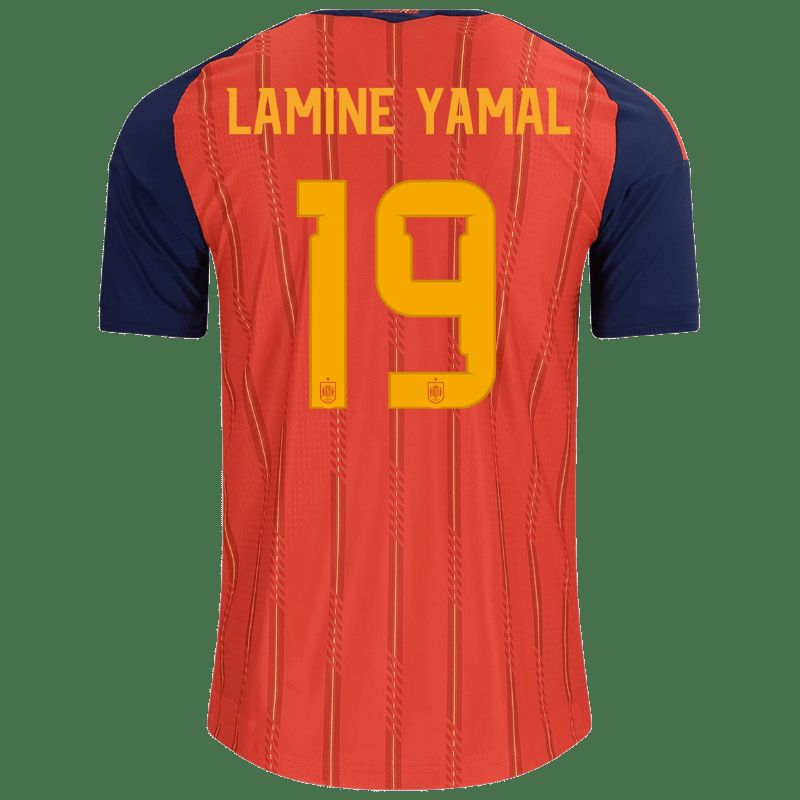
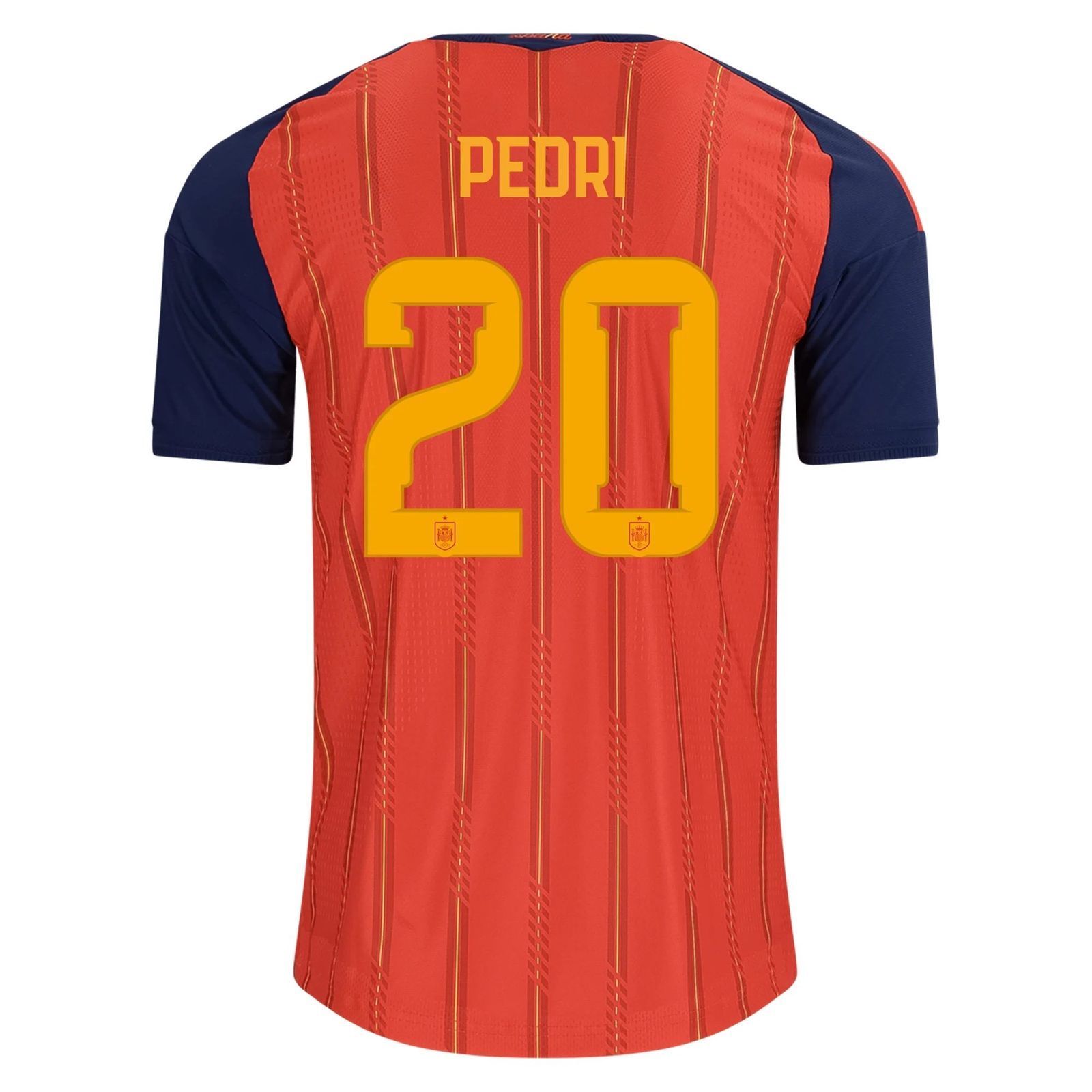
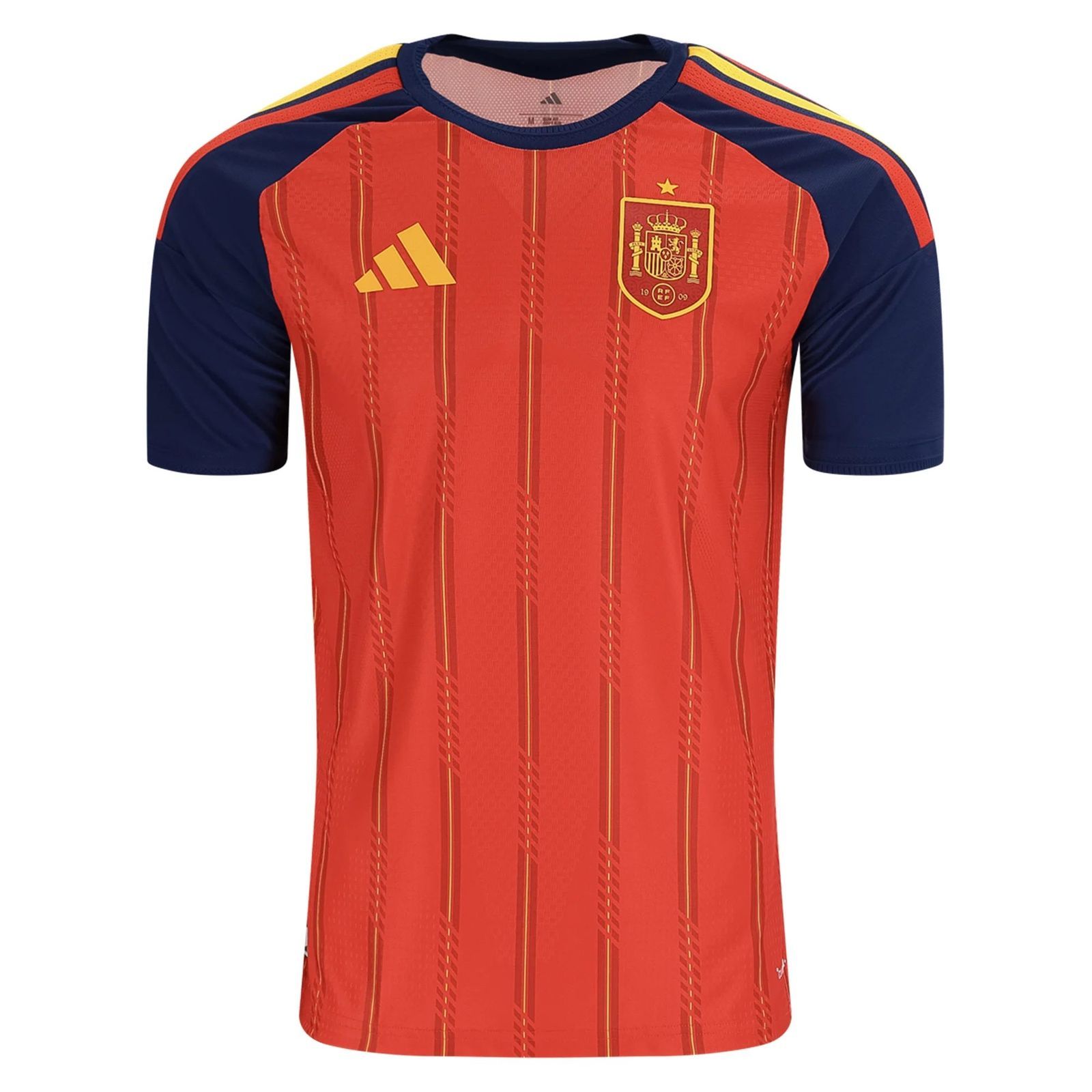
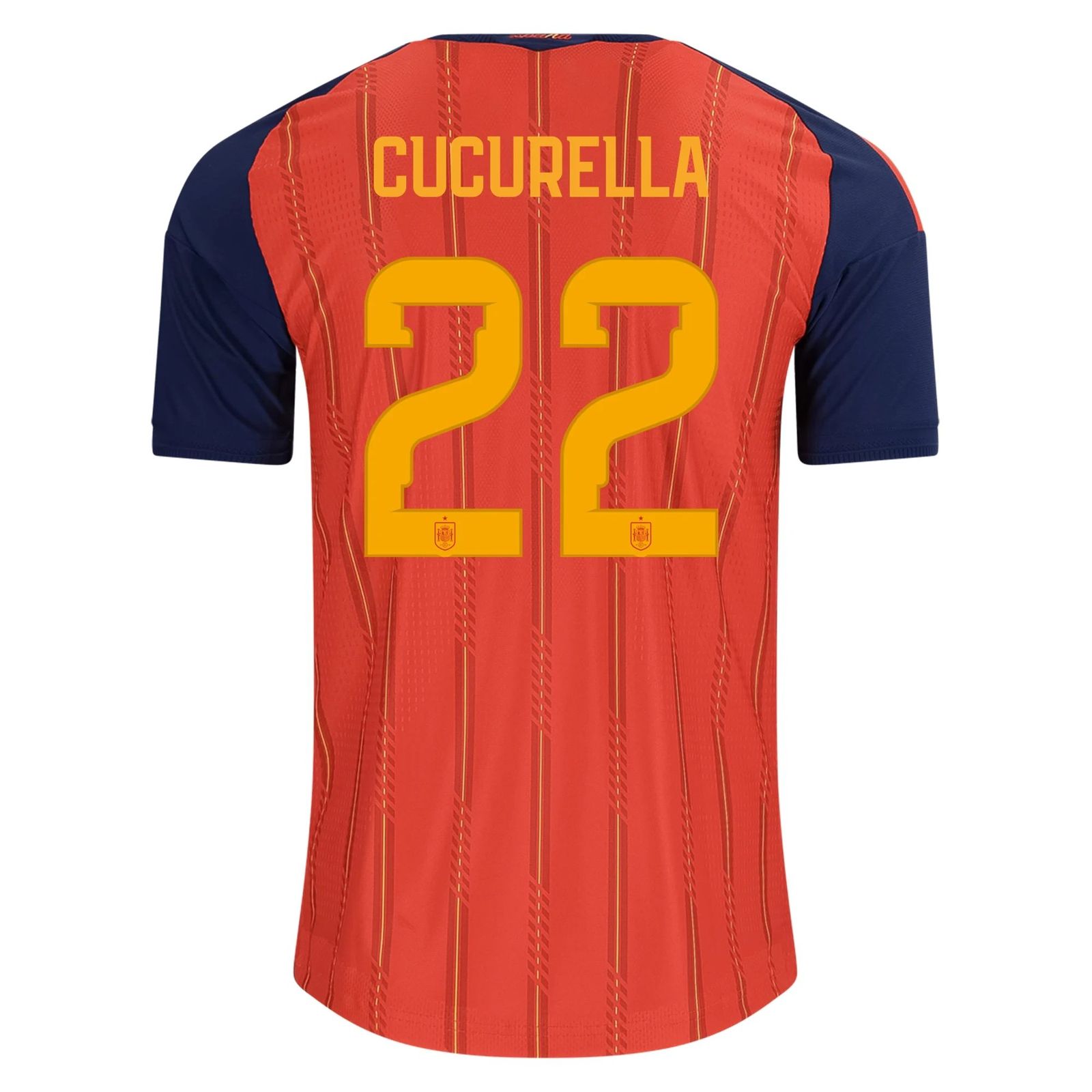
For Euro 2020 (played in 2021), Spain wore a red shirt with dark blue sleeves and a faint pattern that looked like a map of the country. The collar was a simple crew neck, and the adidas stripes ran down the shoulders in navy.
Fans split straight down the middle. Some loved the sleeve contrast and the subtle map detail – it felt like a proper tournament shirt. Others thought the blue sleeves made it look like a training top or, worse, a bootleg you'd find on a market stall.
I'm in the second camp. The map idea was clever, but the execution was messy, and the shirt never looked right under the lights. It's a miss.
3. The 2014 home shirt – the one that divided the dressing room
Spain's 2014 World Cup home shirt was a deep red with a gradient fade to darker red at the hem, plus a gold crest and gold adidas stripes. The collar was a V-neck with a subtle insert.
Some fans call it a classic – the shirt of the tournament where Spain's golden generation said goodbye. Others say the gradient made it look like a cheap knock-off and the gold was too flashy for a team that usually keeps it simple.
I lean towards the critics. The gradient was a gimmick, and it dates the shirt badly. But I'll admit the gold crest popped.
4. The 2016 home shirt – the one with the electric blue
For Euro 2016, Spain went with a red shirt that had a bright blue gradient on the sleeves and a crew neck collar. The adidas stripes were white, and the whole thing felt like a departure from the traditional red-and-gold.
Plenty of fans hated the blue – it felt more France than Spain, and the gradient looked like something from a mid-2000s training range. But a sizeable minority loved the boldness, arguing that Spain needed a shake-up after the 2014 disaster.
My take: it's not as bad as the 2018 shirt, but it's still a low point. The blue was a step too far.
5. The 2010 home shirt – the one that started the debate
Spain's 2010 World Cup home shirt is the one that divides fans the most. It was a simple red shirt with a single gold stripe across the chest (the 'sash' design) and a V-neck collar with a gold trim. The adidas stripes were gold, and the crest sat proudly in the middle.
For many, it's a grail – the shirt of the greatest moment in Spanish football history, worn by Iniesta when he scored the winner in Johannesburg. The sash was a nod to Spain's 1920s kit, and it looked elegant.
But a vocal minority can't stand it. They say the sash made the shirt look like a pageant sash, and the V-neck was too deep. Some even argue it's overrated because the football was so good that the shirt gets a free pass.
I'm with the majority: it's a classic. The sash was a brave choice that paid off, and it's the first Spain shirt I'd rescue from a burning house.
Common questions, quick answers
Which Spain shirt is the most overrated?
The 2010 home shirt gets a free pass because of the World Cup win, but the sash design wasn't for everyone. Still, it's hard to argue with the memories attached to it.
What was Spain's worst away kit?
The 2018 away shirt – a white number with a weird geometric pattern – was a low point. It looked like a golf shirt, and the players never seemed comfortable in it.
Are Spain's 2022 home shirts any good?
The 2022 home shirt was a return to a cleaner red with a subtle pattern, and most fans seemed to approve. It's not a grail, but it's a step back in the right direction.
Read next
- Buy Spain Jersey Online Cheap: A No-Nonsense Guide to Getting It Right
- How to Buy Spain Jersey Online Cheap: A Fan's No-Nonsense Guide
Shop Spain shirts
Current Spain shirts — fan and player versions, honest pricing.