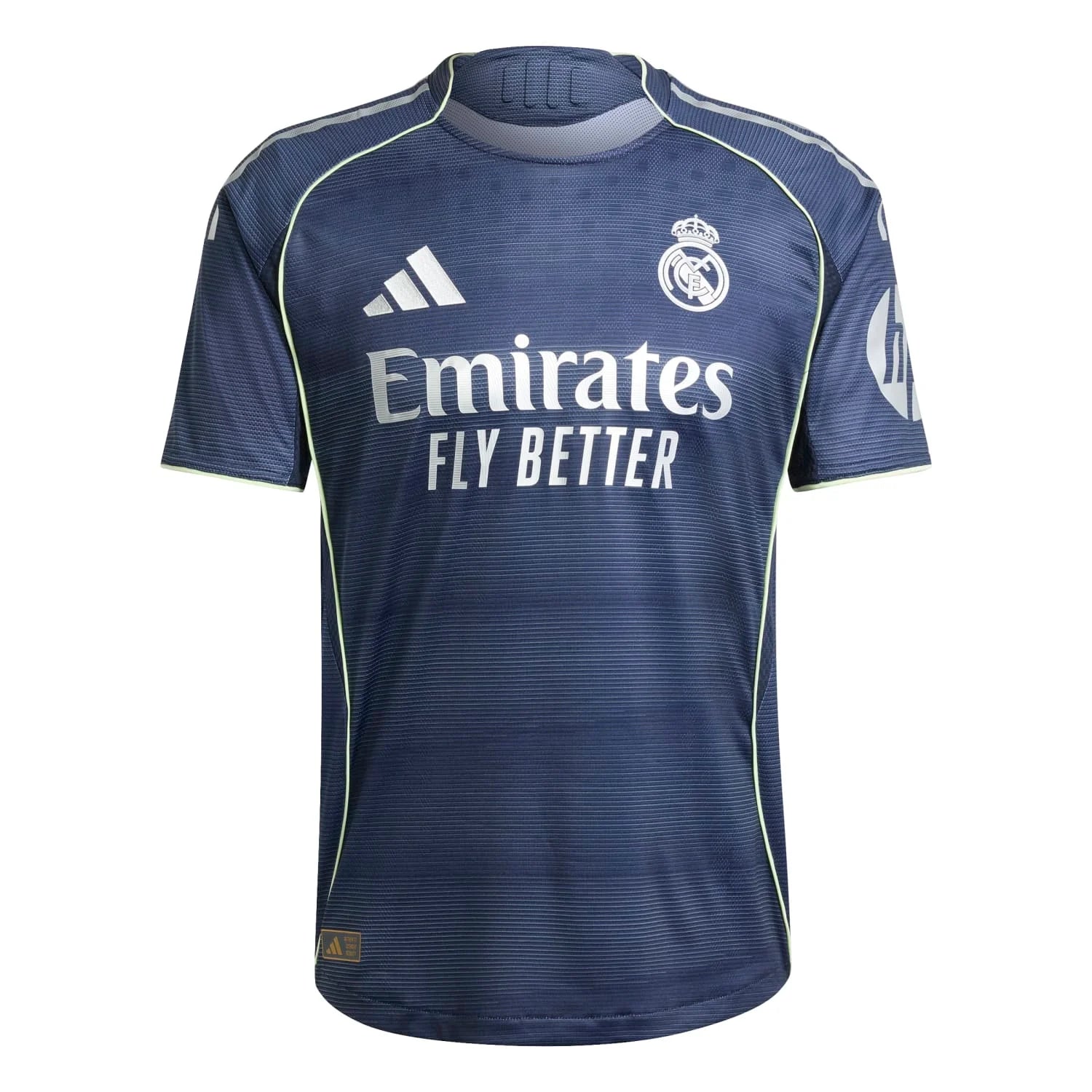
Another season, another leaked Real Madrid kit doing the rounds before the club even announces it. This time it's the 2026/27 second strip, and the internet has opinions. Shocking, I know. The colourway is getting a lot of love, but that RMCF text? Not so much. And then there's the V-neck, which is causing more drama than a Clásico penalty shout. Let's get into it.
That RMCF text is doing too much
I'll be honest: when I first saw the leak, I thought the 'RMCF' lettering was a watermark slapped on by whoever took the photo. Turns out it's part of the actual design. And yeah, I'm not sold. It feels like the kit equivalent of a PowerPoint transition—unnecessary and a bit distracting. The rest of the shirt is clean, though. The colourway is lovely, a proper nod to that green Bwin-era classic that everyone seems to love. It's a worthy successor in terms of palette, but that text is like a bad tattoo on an otherwise fit model. Maybe it'll look better on the pitch, under floodlights, with players sprinting around. Or maybe it'll still look like a placeholder. We'll see.
The V-neck: love it or hate it?
Speaking of divisive details, the V-neck is back. Some of you are already saying it's the best of the upcoming collection but that the V is making you hesitate. I get it. V-necks can look sharp or they can look like you're wearing your dad's old golf shirt. On a football kit, it really depends on the collar and how it sits. From the leaks, this one seems pretty deep, which might be a problem for some. Personally, I don't mind a V-neck as long as it's not too wide. But I can see why it's a dealbreaker for others. If you're spending that much on a shirt, you want to actually wear it, not just frame it.
The Modrić shirt disaster (and why it's relatable)
Now for the best story in the thread: a fan whose boyfriend tried to surprise her with a long-sleeve Modrić 19 shirt. Except he doesn't watch football, so he got the name printed as 'Luka Modrić 19'—both name and surname. So she ended up with a shirt that says 'Luka Modrić 19' on the back, which is technically not wrong but definitely not right. A year later, he tries to make up for it and gets her the short-sleeve version. But he makes another mistake—probably the same one? She doesn't specify, but now she has two shirts with something off. The kicker: he's so sweet she can't even be mad. This is the kind of content I live for. It's a reminder that football shirts are emotional, and sometimes the imperfections make the best stories. Also, if you're buying a shirt for a fan, maybe double-check the printing. Or just ask.
Is this the 2013 Manchester United kit?
One commenter asked if this is the jersey we wore when we beat Manchester United in 2013. I had to think about that. That season's second kit was actually blue, I believe, with some silver accents. But the colourway here does have a similar vibe to some of our older away kits. It's not a direct copy, but I can see why someone might get confused. If anything, this new one feels like a modern take on that green Bwin kit, which is a good thing. That green kit is a cult classic for a reason—it was clean, the colour popped, and it had that Bwin sponsor which somehow made it look even better. If this new one can capture half of that magic, it'll be a hit.
Will it look better on the pitch?
Leaks always look worse than the real thing. Lighting, fit, and the way the fabric moves can completely change a kit's vibe. Remember when everyone hated the pink away kit? Then we wore it and suddenly it was iconic. So I'm holding judgment until I see it in action. The colourway is strong enough that it might overcome the RMCF text and the V-neck. But if the text is too prominent, it could be a distraction all season. Fingers crossed the club tones it down for the official release. Or maybe they'll double down and we'll all just have to accept it. Either way, I'll probably still want one.
Recommended kits from LISIMKE
Picked from our store to match this article. Browse all kits →